With smartphones in every hand and on-the-go internet browsing being the norm, optimising your blog for mobile isn’t just a good strategy–it’s needed for survival in the digital sea of content. This comprehensive checklist is your go-to, guiding you through the tricks and traps of mobile SEO. Whether you’re an aspiring content marketer, a blogger, or a digital entrepreneur, this checklist has got you covered.
No need to worry if you’re unfamiliar with the currents of SEO; Aemorph made an optimisation for mobile for clients and to achieve that following these steps are easy to navigate for beginners and experts. So let’s get on the optimisation process.
Mobile First, SEO Later? Why Prioritising Mobile Optimisation is Important (Without Feeling Lost at Sea)
In today’s tech-swathed world, not having a mobile-optimised blog is akin to sailing without a compass: you might move forward, but you are bound to lose your way. Here’s why you should optimise for mobile-friendly territories:
- Increasing mobile search traffic and user engagement: More people browse on mobile devices than ever before.
- Improving Google search ranking and visibility: Mobile responsiveness is a key ranking factor for search engines.
- Providing a positive user experience for all audiences: A blog that loads well on mobile is a blog that welcomes more readers.
- Three-Part Mobile Responsive Design Requirement

(Speed, SEO Friendly and Support with more browsers will boost your engagement with mobile users)
Chart Your Course to Mobile Success: A Step-by-Step Checklist for Blog Optimisation
Navigate through these 19 important steps to ensure your blog is shipshape for mobile users.
Step 1: Responsive Design
Ensure your blog layout adapts to all screen sizes. This allows your blog to be easily accessible and readable on various devices, including smartphones, tablets, and desktop computers. By implementing responsive design, you provide a seamless user experience, making it easier for your audience to navigate and engage with your content.
- Design Should Respond To Every Browser
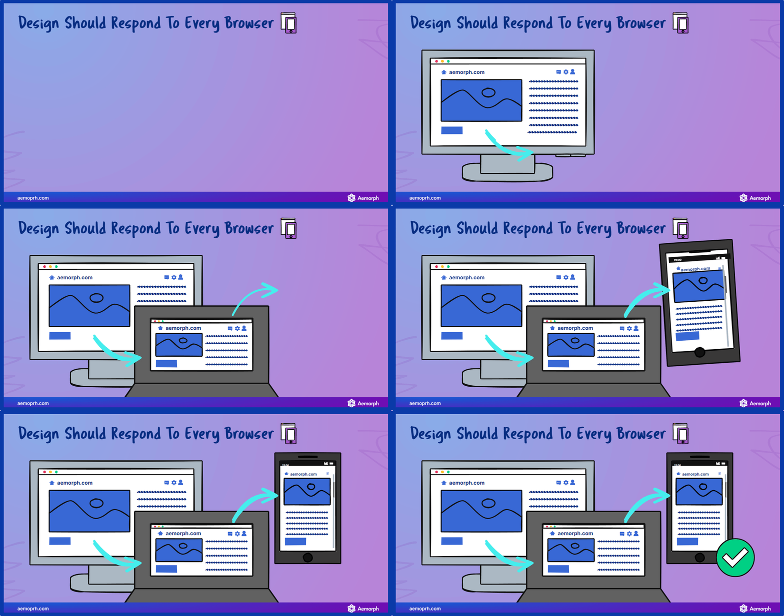
(When designing the browser or website you should consider putting it on every device, even for mobile)
Step 2: Speed Loading
Improve the speed; optimise images, cut down on code, and leverage caching. By optimising your blog’s loading speed, you create a faster and more efficient browsing experience for your visitors. This not only improves user satisfaction but also helps with search engine rankings. Optimise images by compressing them without sacrificing quality, minimise unnecessary code that can slow down your website, and utilise caching techniques to store certain elements of your blog, reducing the time it takes to load each page.
- Boost Your Website Speed Impact Overall Website Health
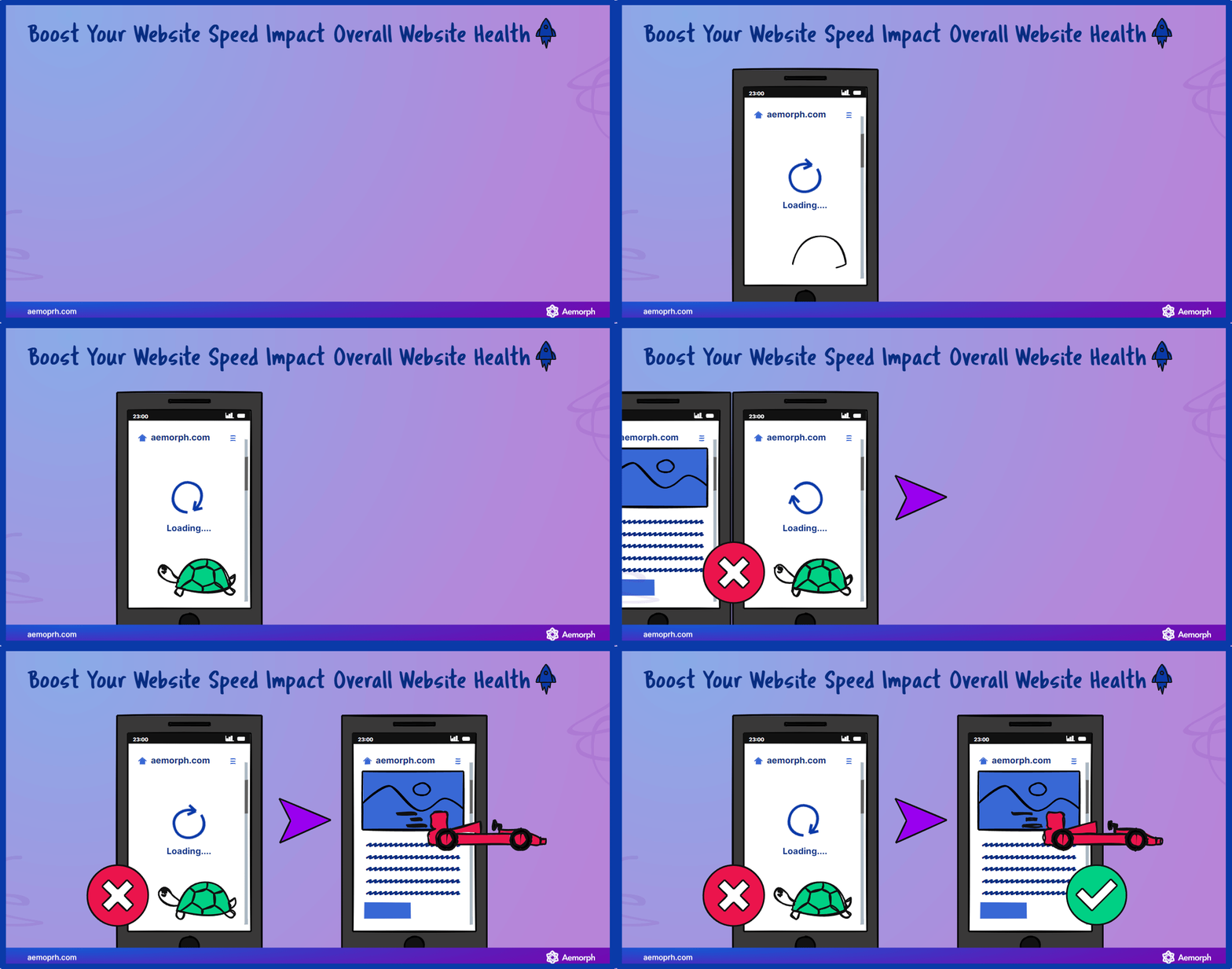
(More faster loading speed has a better impact on your website since users don’t have to wait for the website to load to check them out)
Step 3: Finger-Friendly Navigation
Make sure buttons and links are easy to tackle. With finger-friendly navigation, you enhance the usability of your blog on touch-enabled devices. Ensure that buttons and links are large enough to be easily tapped with a finger, allowing your visitors to navigate through your blog effortlessly.
- Phone Navigation Example For Users
(People have different types of holding their phone, so making your design based on how they use the phone will benefit their use of your website. Also appreciate your work as well)
Step 4: Readable Fonts & Text Size
Choose fonts as clear as possible and a text size visible for all mobile devices. Selecting readable fonts and appropriate text sizes is important for mobile optimisation. Opt for fonts that are legible on small screens and ensure that the text size is large enough to be comfortably read without zooming in. In general, a font should be 12-16pt on a mobile screen, 15-19pt on a tablet, and 16-20pt on a desktop computer screen. This improves the readability of your content and enhances the overall user experience.
- Text Size on Phone From Your Website

(Text size is important with phone users as well, If it’s readable on the computer it may or may not be bigger for the mobile device)
Step 5: Image Optimisation
Keep images sharp yet lightweight. Optimising images for mobile devices involves finding the perfect balance between image quality and file size. Compress images to reduce their file size without compromising their visual appeal. This helps to minimise the loading time of your blog and ensures that your images look crisp and clear on mobile screens.
- Image Optimisation Tools To Increase Speed
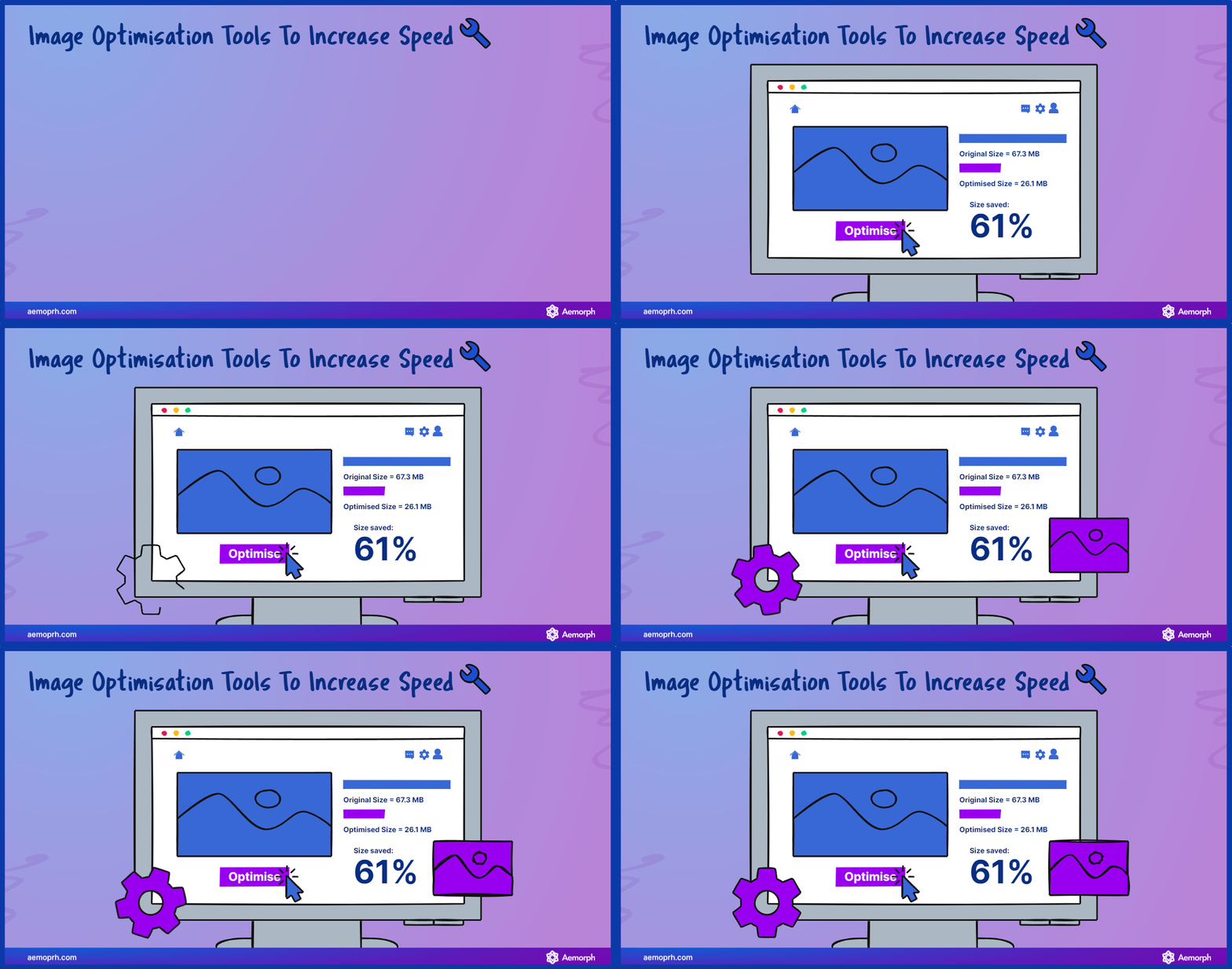
(Using a tool to optimise your picture will help you with the loading speed, not by much for computers but for mobile devices will have a high impact)
Step 6: Always ready for White Space
White space is the space around your content; use it well to prevent a crowded layout. Incorporating white space in your blog design helps to create a clean and uncluttered appearance. It allows your content to breathe and makes it easier for mobile users to focus on the important elements of your blog. Hold on to white space strategically to enhance the visual appeal and readability of your mobile-optimised blog.
- White Space To Create More Visual Appeal

(White Space Example that makes the mobile user experience better in receiving information)
Step 7: Ditch Pop-Ups and Intrusive Ads
Don’t let pop-ups and ads board your visitors’ experience uninvited. Avoid using pop-ups that cover the entire screen or interrupt the reading flow. Instead, focus on providing a seamless and uninterrupted browsing experience for your mobile visitors.
- Pop-Ups and Intrusive Ads Decrease Visitor’s Screen-Time

(People always try to avoid pop-ups and ads, making the closing button bigger might help them stay on your website longer)
Step 8: Local SEO Optimisation
Optimise for local search if your blog caters to a regional audience. If your blog targets a specific geographical location, it’s important to optimise it for local search. This involves incorporating relevant keywords, creating location-specific content, and ensuring that your blog is listed in local directories. By doing so, you increase the visibility of your blog to local audiences and attract more targeted traffic.
- Local SEO To Optimise Your Local Search

(Local SEO will help you identify the competitor, keyword and approach for design with many options for you to choose)
Step 9: Structured Data Markup
Use schema to ensure your blog’s details appear in rich snippets. Implementing structured data markup helps search engines understand the content and context of your blog better. This allows search engines to display rich snippets in search results, providing additional information to users and increasing the visibility of your blog. Utilise schema markup to enhance the presentation and visibility of your content on search engine result pages.
- Content Data Markup

(Data structure check for a blogger to identify if their blog has every optimisation for releasing)
Step 10: Leverage Accelerated Mobile Pages (AMP)
Consider using AMP for faster pages. Accelerated Mobile Pages (AMP) is a framework that optimises web pages for quick loading on mobile devices. By adopting AMP, you can significantly improve the loading speed of your blog, providing a seamless and lightning-fast browsing experience for your mobile visitors. Implementing AMP can boost your search engine rankings and increase visibility in mobile search results.
- Optimise Page With AMP

(Website with AMP will have a faster loading time and that will increase impressions by 50%)
Step 11: Test, Test, and Test Again
Use mobile testing tools to spot trouble early. Regularly testing your blog on various mobile devices and using mobile testing tools helps you identify any issues or inconsistencies in your mobile optimisation. By spotting and resolving problems early on, you can ensure your blog delivers a smooth and user-friendly experience across different mobile platforms.
- Testing Website Speed Using Tools

(The more you test the more you know, sometimes over-optimising your website will cause your website to get slower.)
Step 12: Stay Updated with Mobile Trends
Keep up with mobile SEO trends and steer your strategy by them. Mobile technology and user behaviours are constantly evolving, so it’s necessary to stay updated with the latest mobile SEO trends. Monitor industry news, follow expert blogs, and keep an eye on changes in search engine algorithms to adapt your mobile optimisation strategy accordingly. By staying ahead of the curve, you can maximise the effectiveness of your mobile-optimised blog.
- Mobile Trend To Maximise Your Mobile-Optimised Content
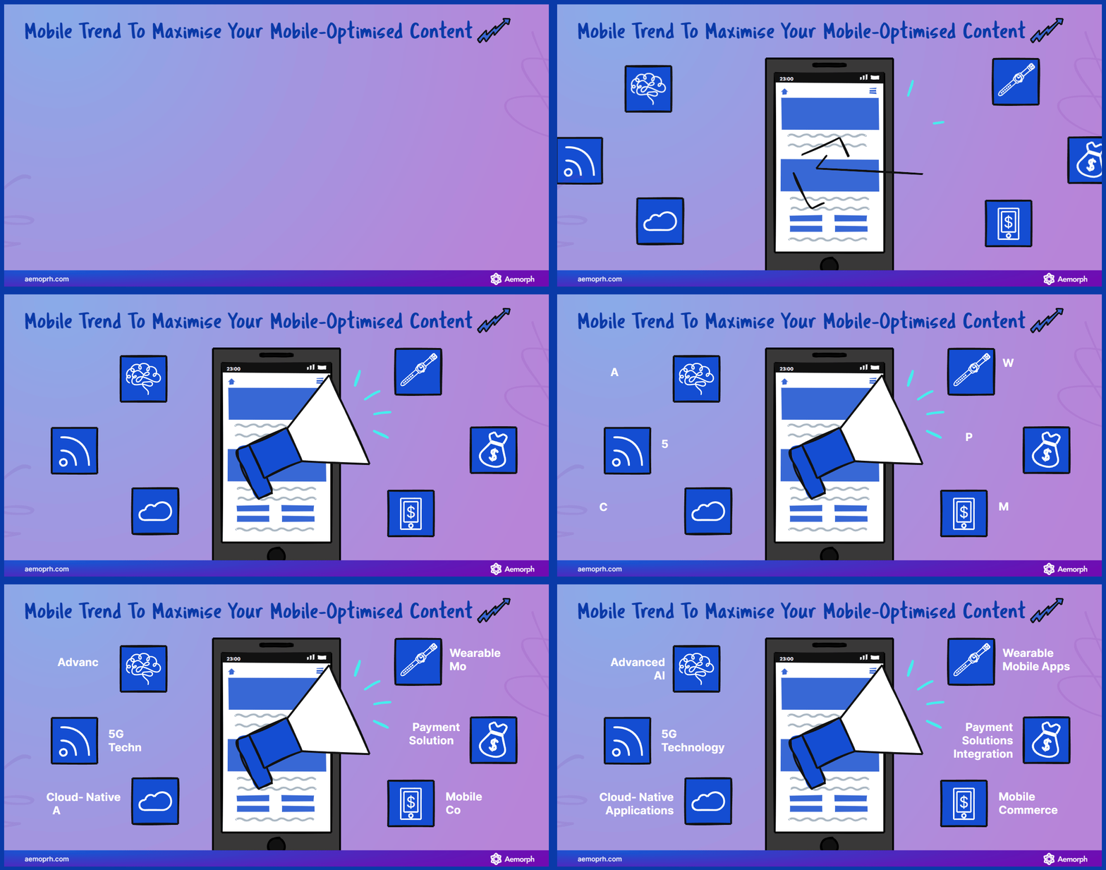
(Some content trends are high-value content you can create for your mobile content, following them will increase your reach as well)
Step 13: Content Optimisation for Mobile
Trim long paragraphs and choppy sentences for breese-like reading. Optimising your content for mobile devices involves making it easy to read and digest on smaller screens. Break up long paragraphs into shorter ones, use subheadings to organise your content, and ensure that sentences flow smoothly. By optimising your content for mobile, you improve readability and make it more engaging for mobile visitors.
- Optimise Your Content For Mobile Users
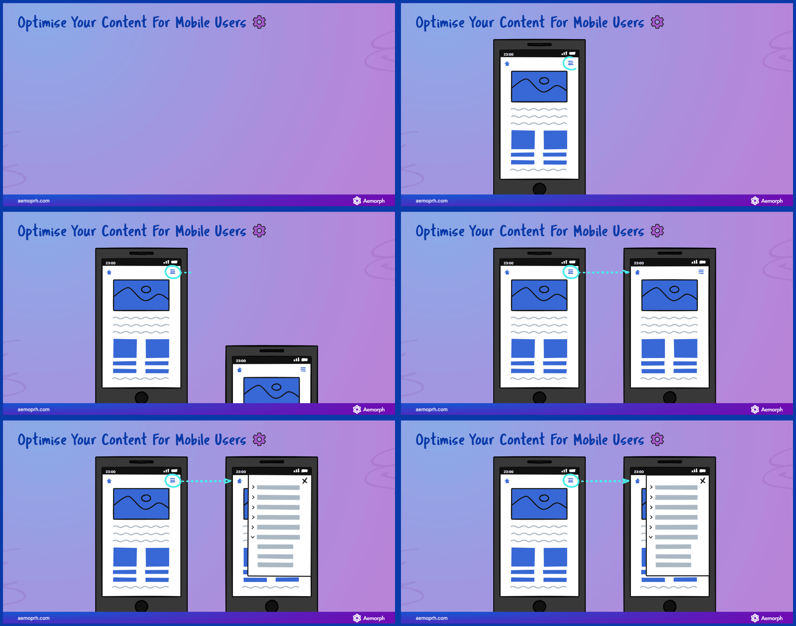
(Content is most likely built on computers and optimising for mobile is another option, making mobile-friendly content will help you reach more visitors as well)
Step 14: Support with Interactive Content
Try polls, quizzes, and surveys to engage and entertain. Interactive content can significantly enhance the user experience on mobile devices. Incorporate polls, quizzes, surveys, or other interactive elements to engage your mobile audience and make your blog more interactive and entertaining. This not only increases user engagement but also encourages social sharing and repeat visits.
- Interactive Content For Mobile Users

(Activities with mobile sometimes stay together, making your content and optimise the interactive stuff in there will increase your reach as well)
Step 15: Social Media Sharing Made Easy
Ensure your content can be shared across the internet. Make it simple for your mobile visitors to share your content on social media platforms. Include social sharing buttons that are easy to locate and use, allowing your audience to share your blog posts with their networks effortlessly. This helps to increase the visibility and reach of your blog across various social media channels.
- Sharing In Social Media
(Social media sharing using variants of the app and this will increase your reach from communities as well)
Step 16: Utilise Mobile Analytics
Study your mobile visitors. Utilise mobile analytics to gain insights into your mobile visitors’ behaviour and preferences. Analyse data such as mobile traffic, bounce rates, popular content, and conversion rates to understand how your mobile audience engages with your blog. Use this information to make data-driven decisions and optimise your blog for better mobile performance.
- Gain Information With Mobile Analytics

(Gaining insight into your user engagement will let you know which design to optimise next)
Step 17: Think Long-Term
Applying mobile optimisation is vital. Mobile optimisation is an ongoing process that requires continuous monitoring and improvement. Keep an eye on emerging trends, user feedback, and changes in technology to adapt your mobile strategy over time. By thinking long-term and staying committed to mobile optimisation, you can ensure that your blog remains relevant and effective in the ever-changing mobile landscape.
- Keep Practicing To Think Long-Term Optimisation

(Keep the basics and practising will let you adjust and make a plan for long-term optimisation)
Step 18: Seek Help from the Crew
Consider consulting SEO professionals or using relevant tools. Consider consulting SEO professionals or utilising relevant tools. If you need assistance with mobile optimisation, don’t hesitate to seek help from SEO professionals or use relevant tools and resources. These experts can provide valuable insights, recommendations, and guidance to ensure that your blog is optimised for mobile devices effectively.
- Gaining Experience From The Expert

(Finding SEO experts is another help you can get for optimise your mobile-friendly content)
Step 19: Celebrate Your Victories
Every new mobile visitor gains, every increase in loading speed, and every uptick in rankings is a victory. Celebrate them! Acknowledge and appreciate the progress you make in mobile optimisation. Each new mobile visitor, improvement in loading speed, and rise in search engine rankings is a testament to your efforts. Celebrate these victories and use them as motivation to continue optimising your blog for mobile success.
If you optimise your blog for mobile users, it will gain more traffic.
- Main Point In Doing Successful Mobile Optimisation
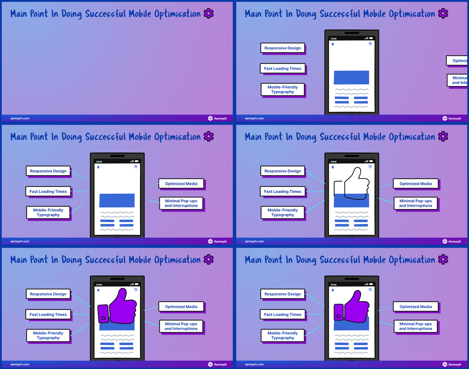
(Optimising the mobile-friendly, staying in these tips will help you go through most of the basic)
Aim for Success: Optimise Your Blog for a Mobile-First World
Steering through the 19 steps on your mobile optimisation adventure will boost your SEO strategy. Remember, while the digital world is everchanging, with the right checklist in hand, your blog will navigate its way to mobile-first success, attracting visitors from near and far. So, get on your optimisation journey!


